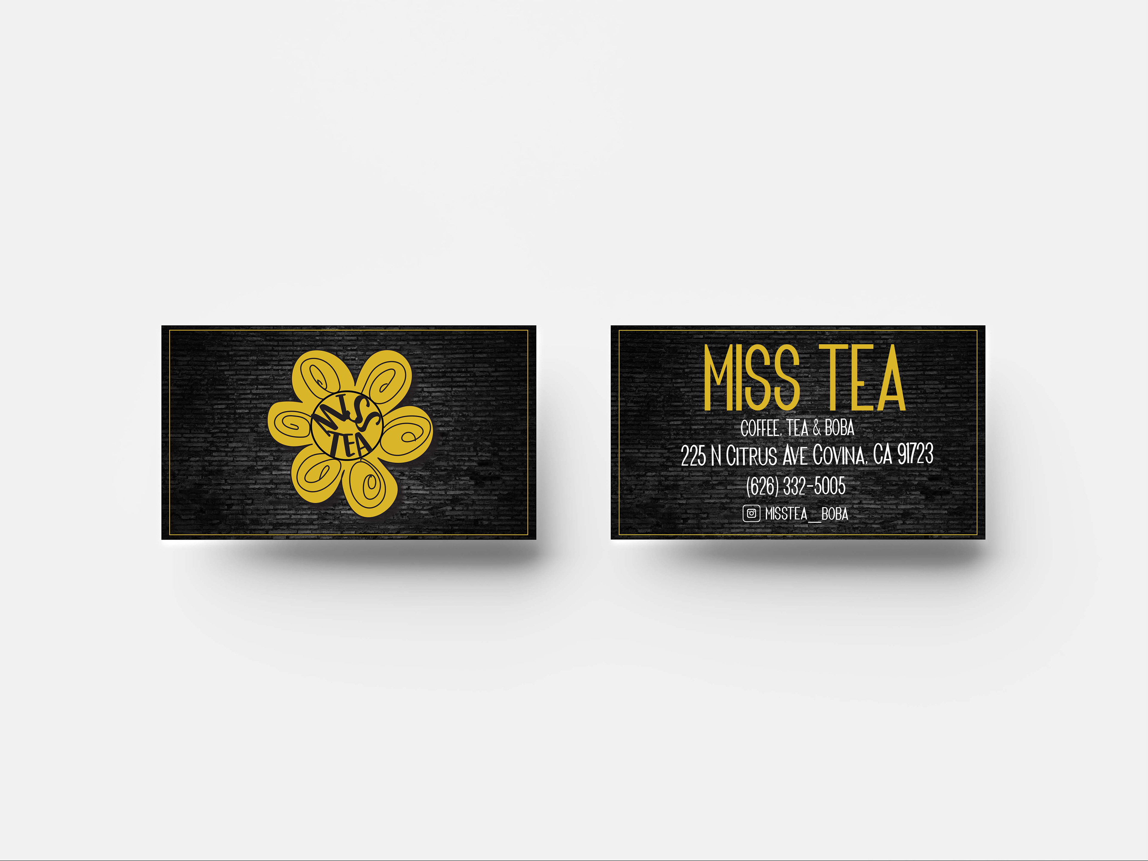
RESTAURANT MENU WITH BUSINESS CARD
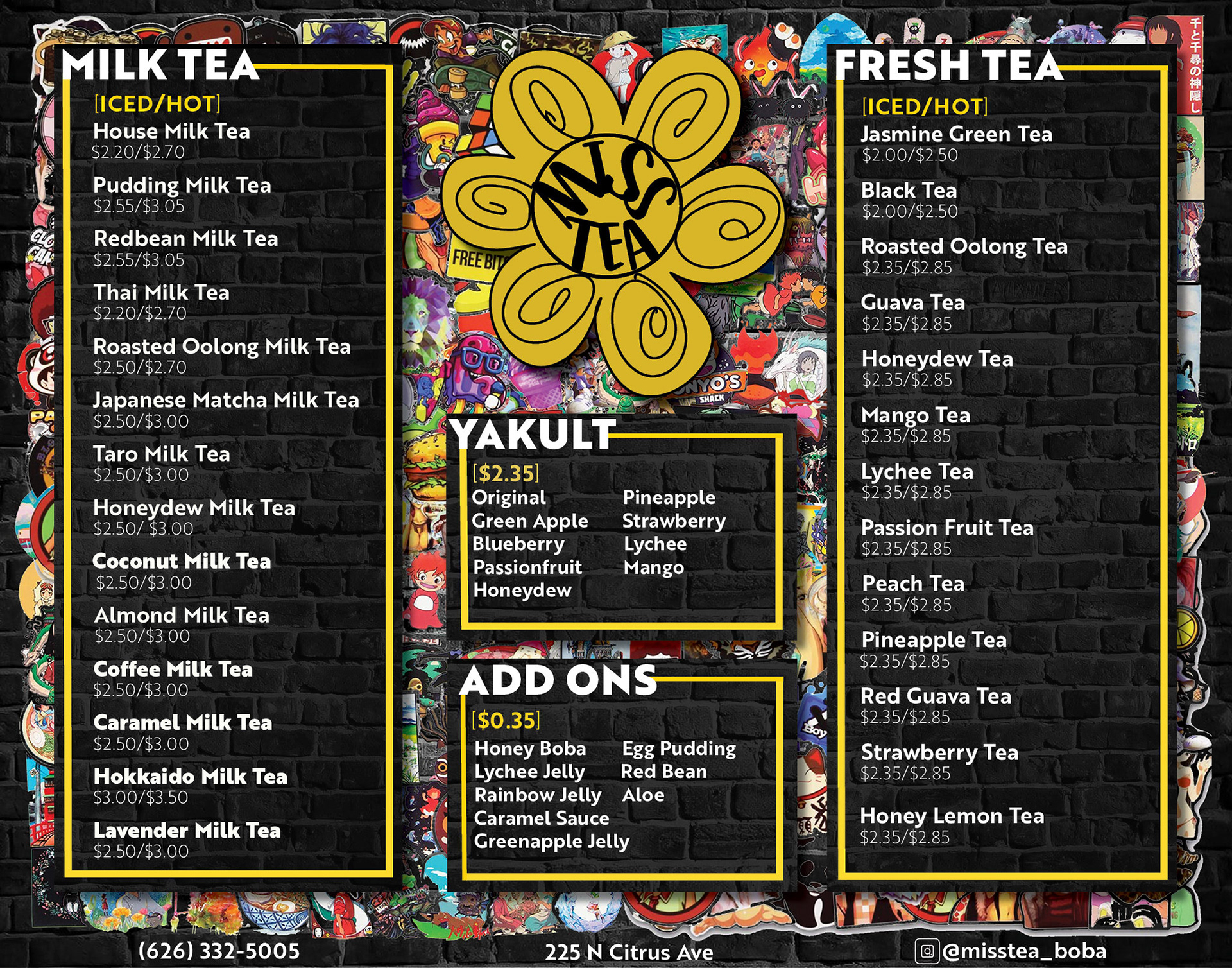
Project for Miss Tea boba shop in the Los Angeles area. The focus is on the style of the establishment. It has brick walls and is heavily influenced by anime. The colors are similar to the original color scheme.
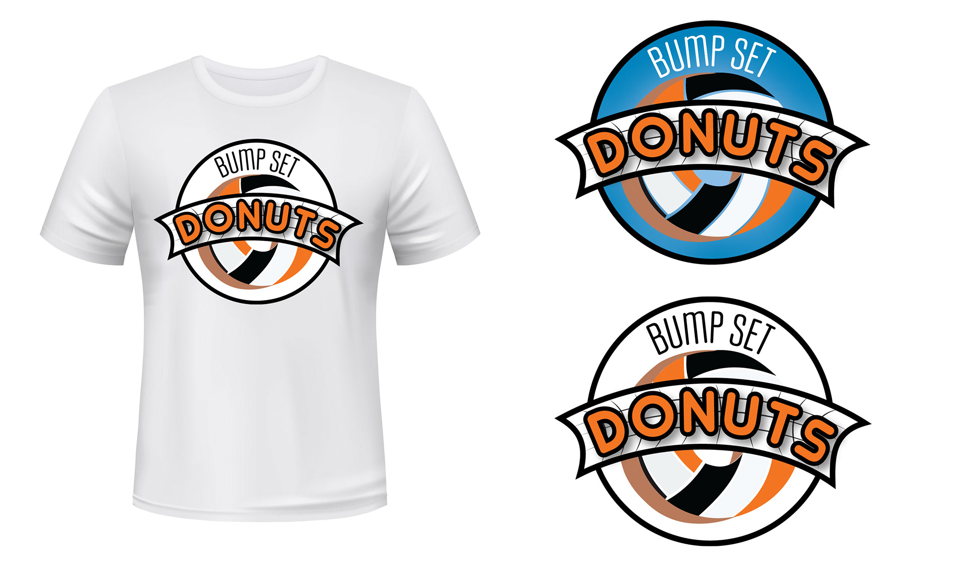
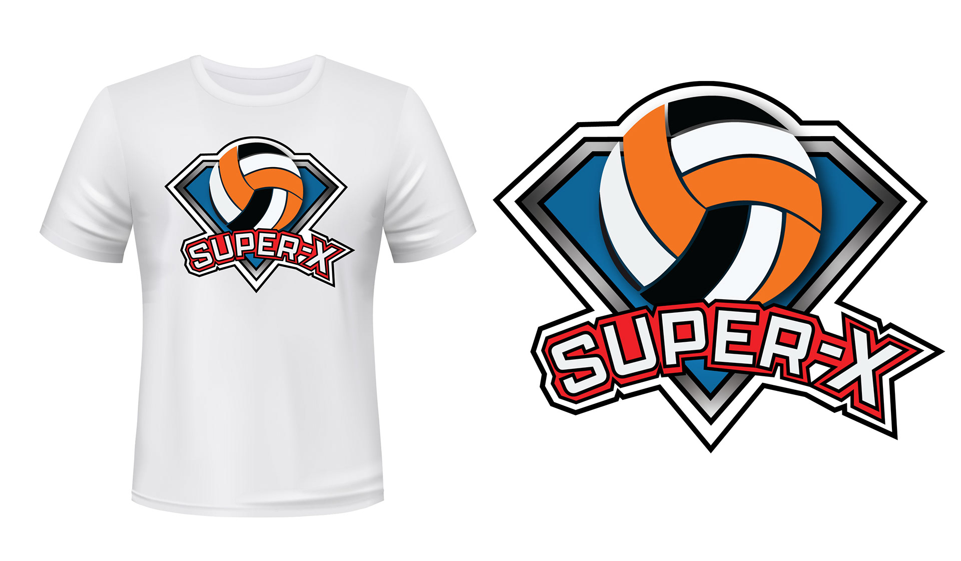
ATHLETICS TEAM LOGO
These logos were created for a company volleyball team in the Bay Area. The main goal was to quickly create a design that was engaging, easily readable and described the team name. It was also important to integrate elements that were selected by the client like the volleyball, shield and colors.
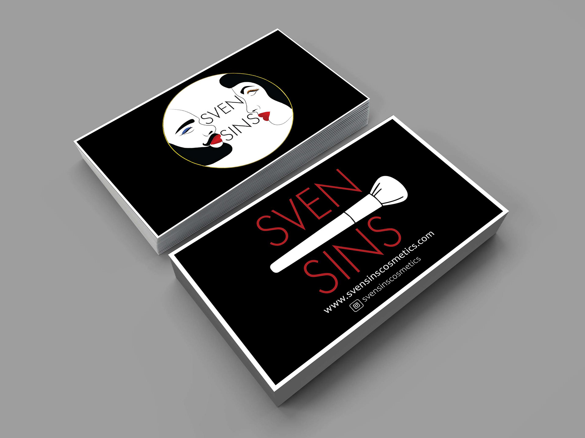
LOGO AND BUSINESS CARD
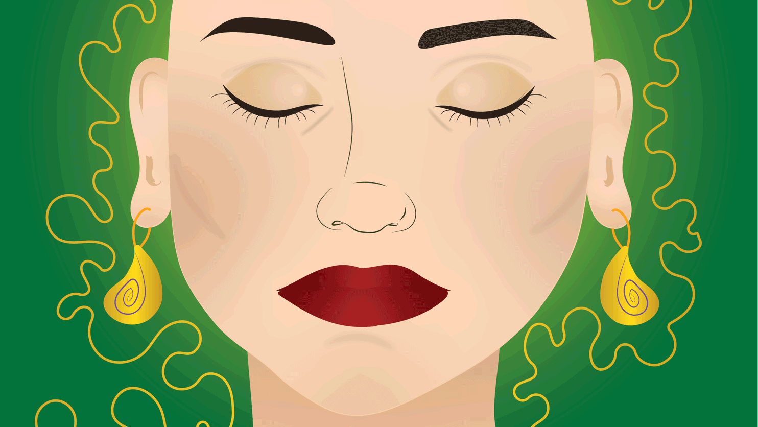
This is for a makeup company that wanted to highlight feminine and masculine elements. The colors are to create contrast and visual impact.
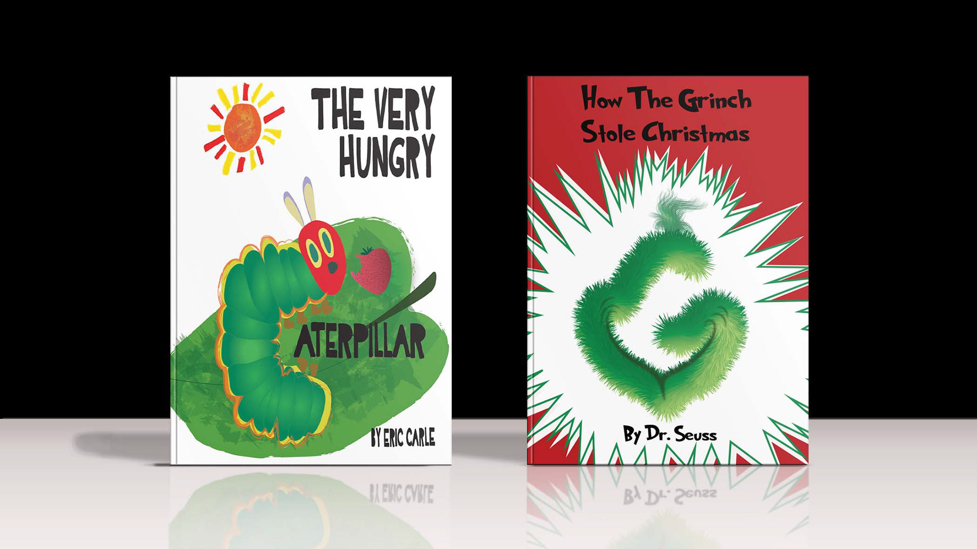
Drop Cap Book Cover
Here are two drop cap book cover designs for the well-known authors Eric carle and Dr. Seuss. They are meant to resemble the original style of covers but highlight the most known elements. The book covers are visually engaging and focus on the main characters.
BOOK COVERS
Below are two different book cover designs created from existing books as a project. The first book cover is based on The Princess Diaries and the second is based on The Hitchhikers Guide to the Galaxy. Both book covers have the design and the mockup available. The challenge for this project was to learn about different aspects of design and storytelling. They are intended to highlight the book's main ideas without giving away too much for readers.
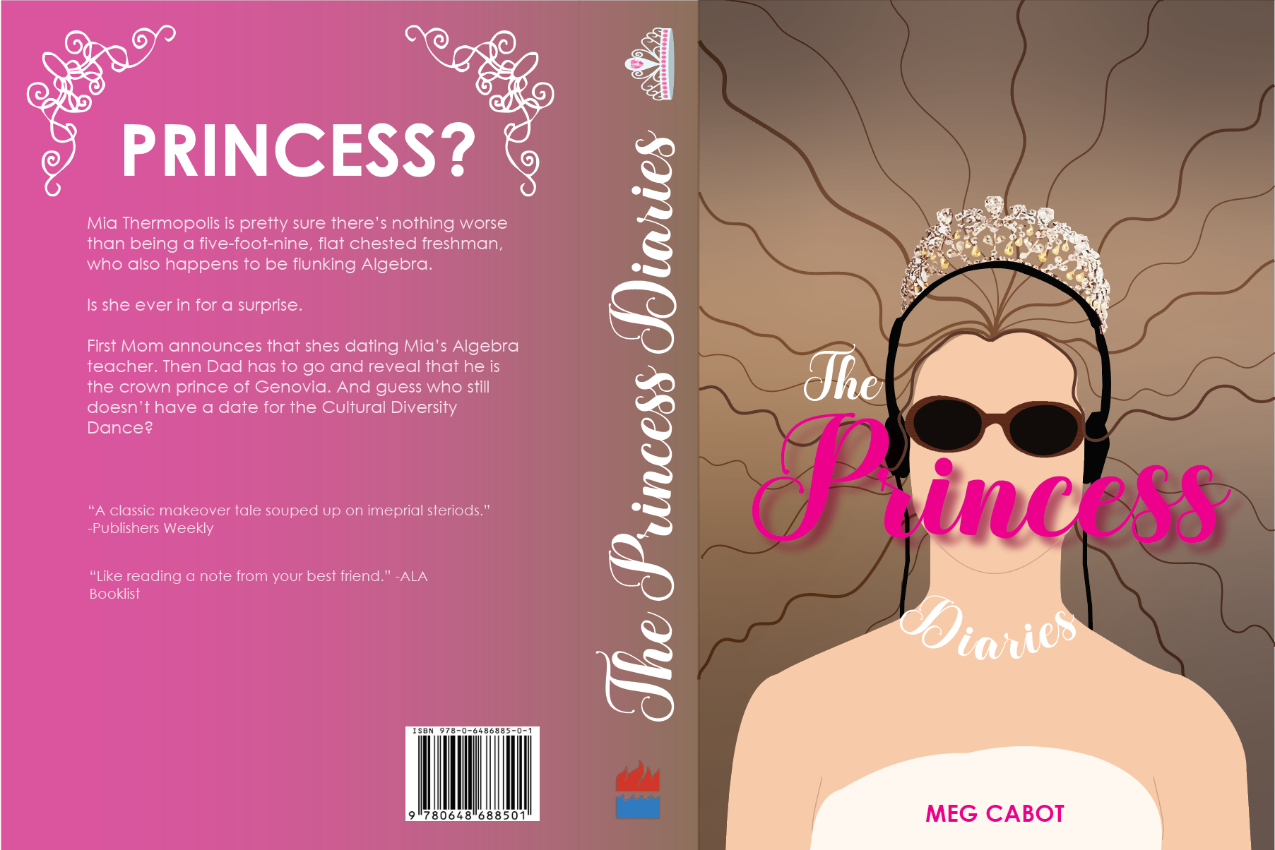
Book Cover Design: The Princess Diaries
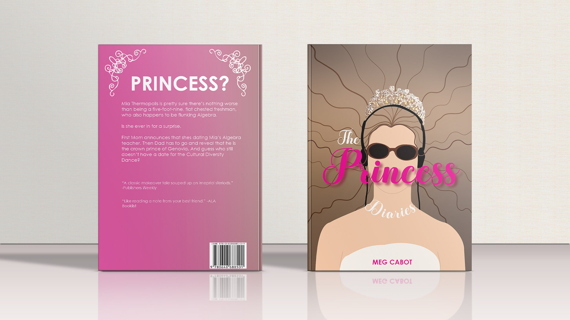
Book Cover Mockup: The Princess Diaries
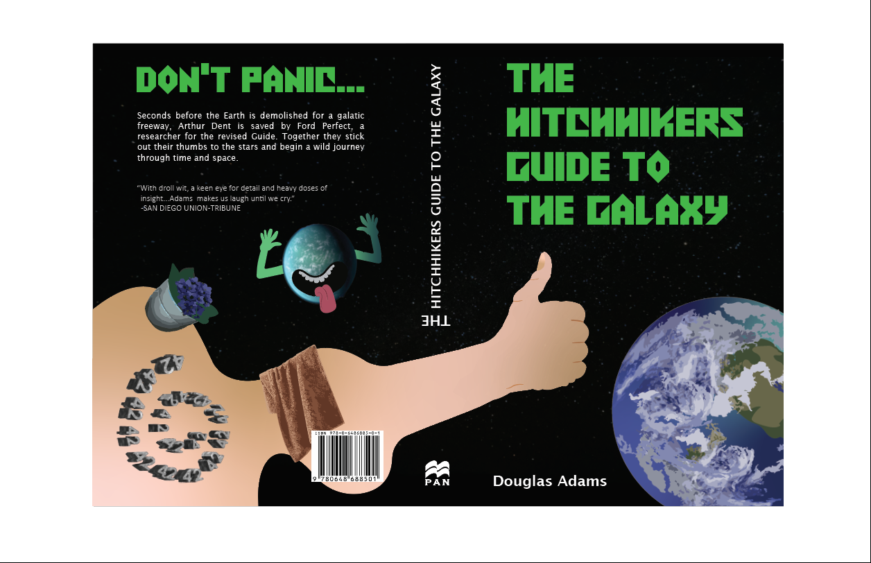
Book Cover Design: The Hitchhikers Guide to the Galaxy
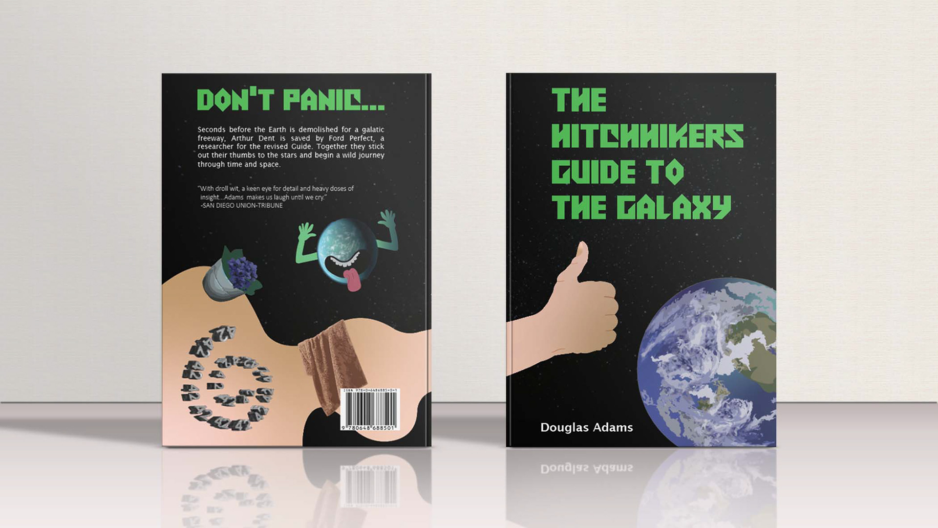
Book Cover Mockup: The Hitchhikers Guide to the Galaxy
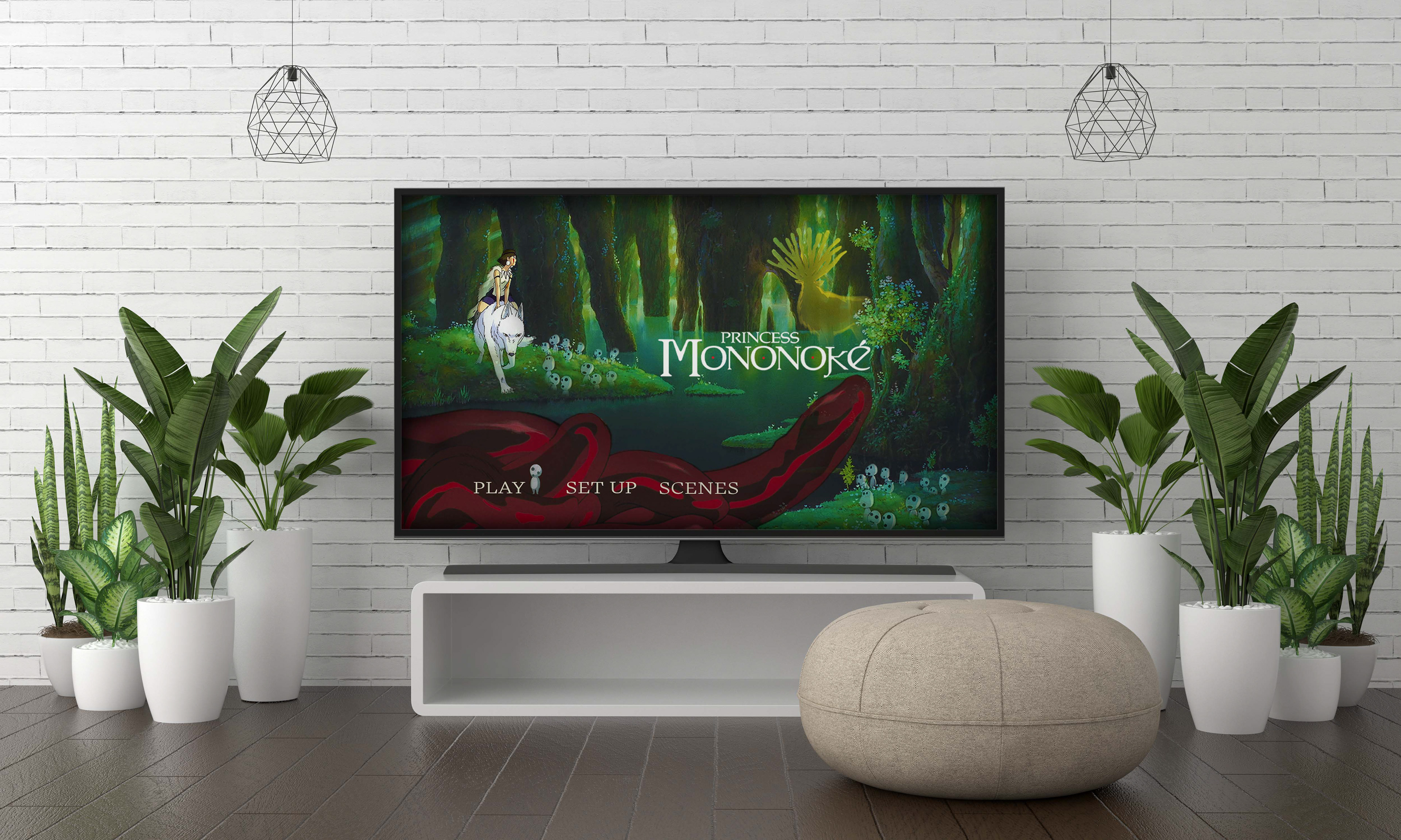
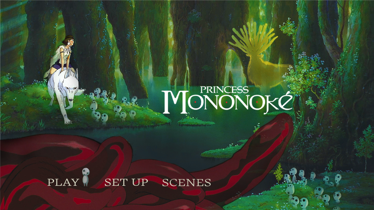
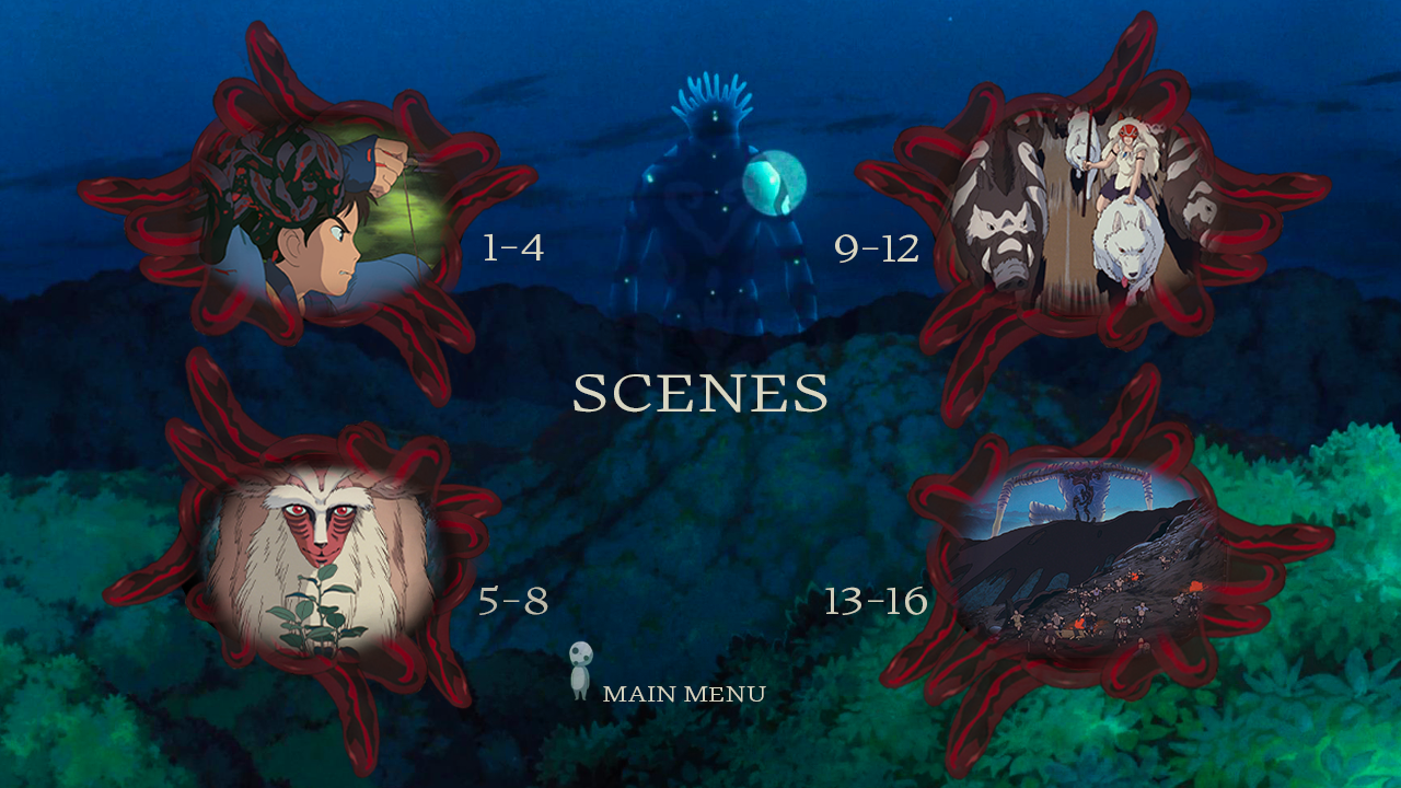
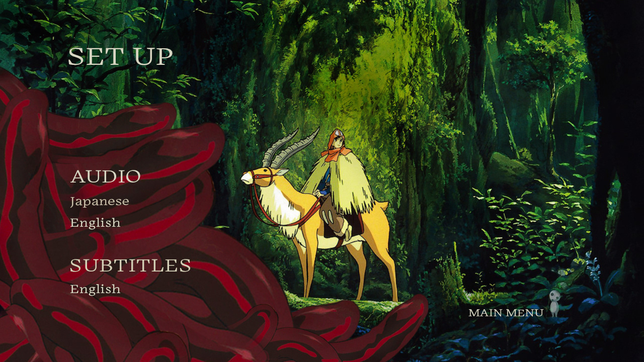
DVD MENU SCREENS
Screens are dedicated to the Studio Ghibli movie, Princess Mononoke. The goal was to capture the vibrant colors and characters of the movie. The screens consist of the Main Menu, Scene Selection, and Setup.
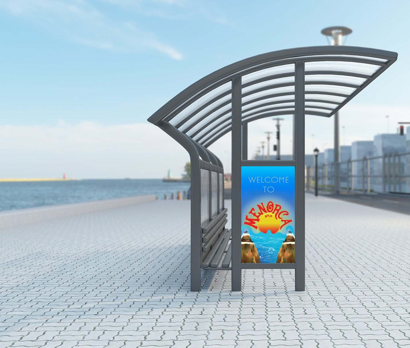
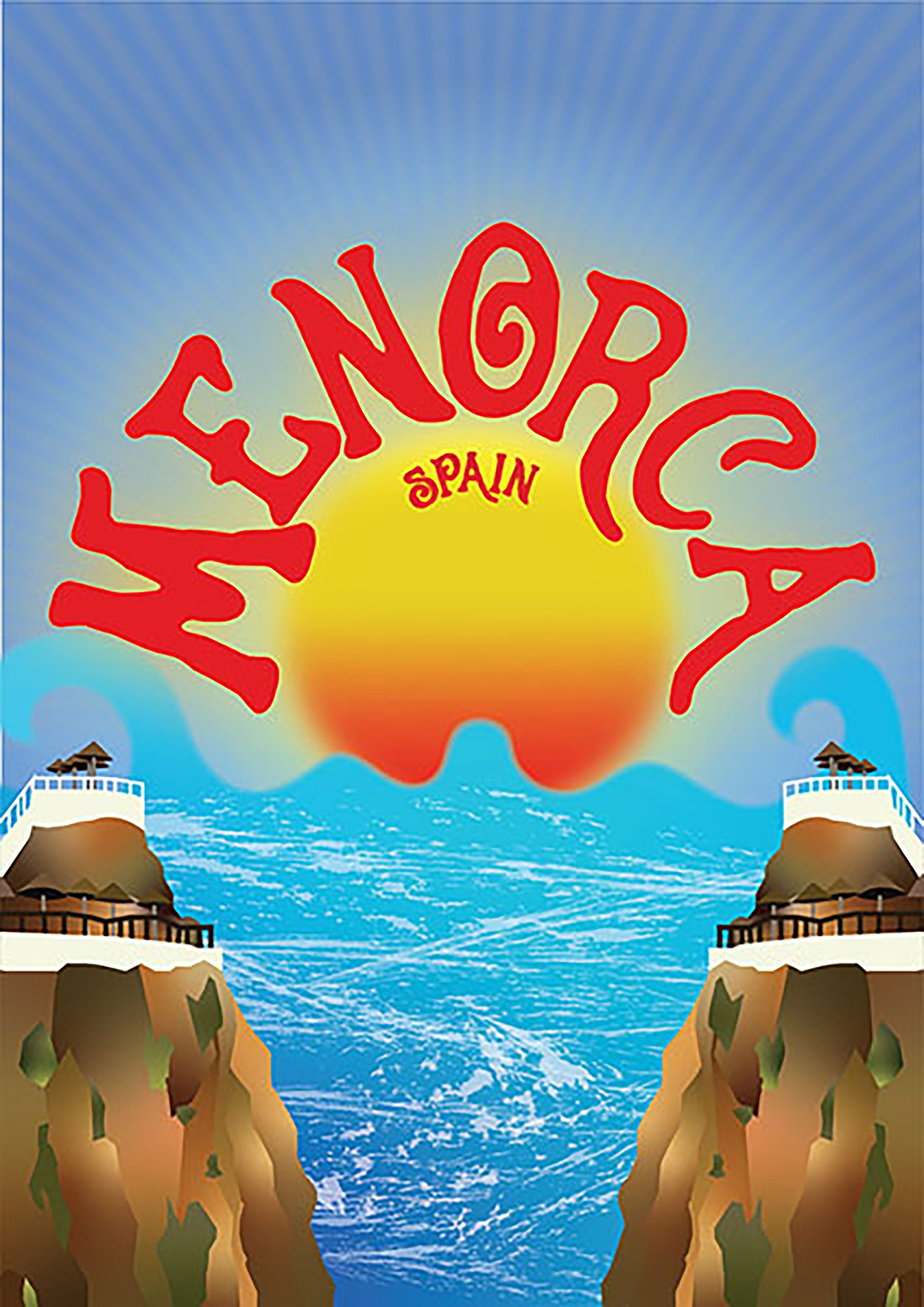
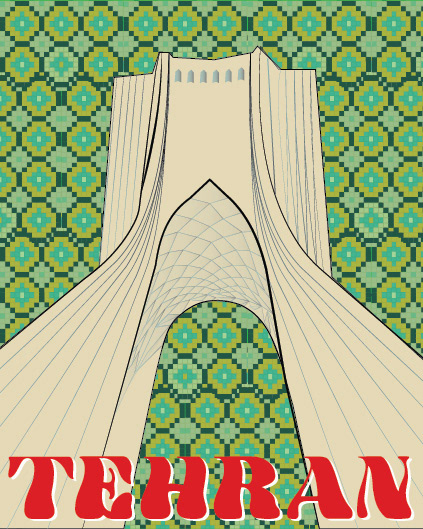
International Typography Contest: posters
The first poster highlights the city of Menorca, Spain. The typeface resembles the feel of the city. The elements highlight the main attractions like the sunrise, water, and cliffs. The poster below that highlights the city of Tehran, Iran. It showcases their famous landmark, The Azadi Tower while embracing architectural patterns and colors.
Magazine Spread
The magazine layout below is dedicated to the famous designer Shigeo Fukuda. The design portrays his use of colors, contrast, and illusions in his works. This project required following layout guidelines for the Communications Arts Magazine to better understand magazine layout design.
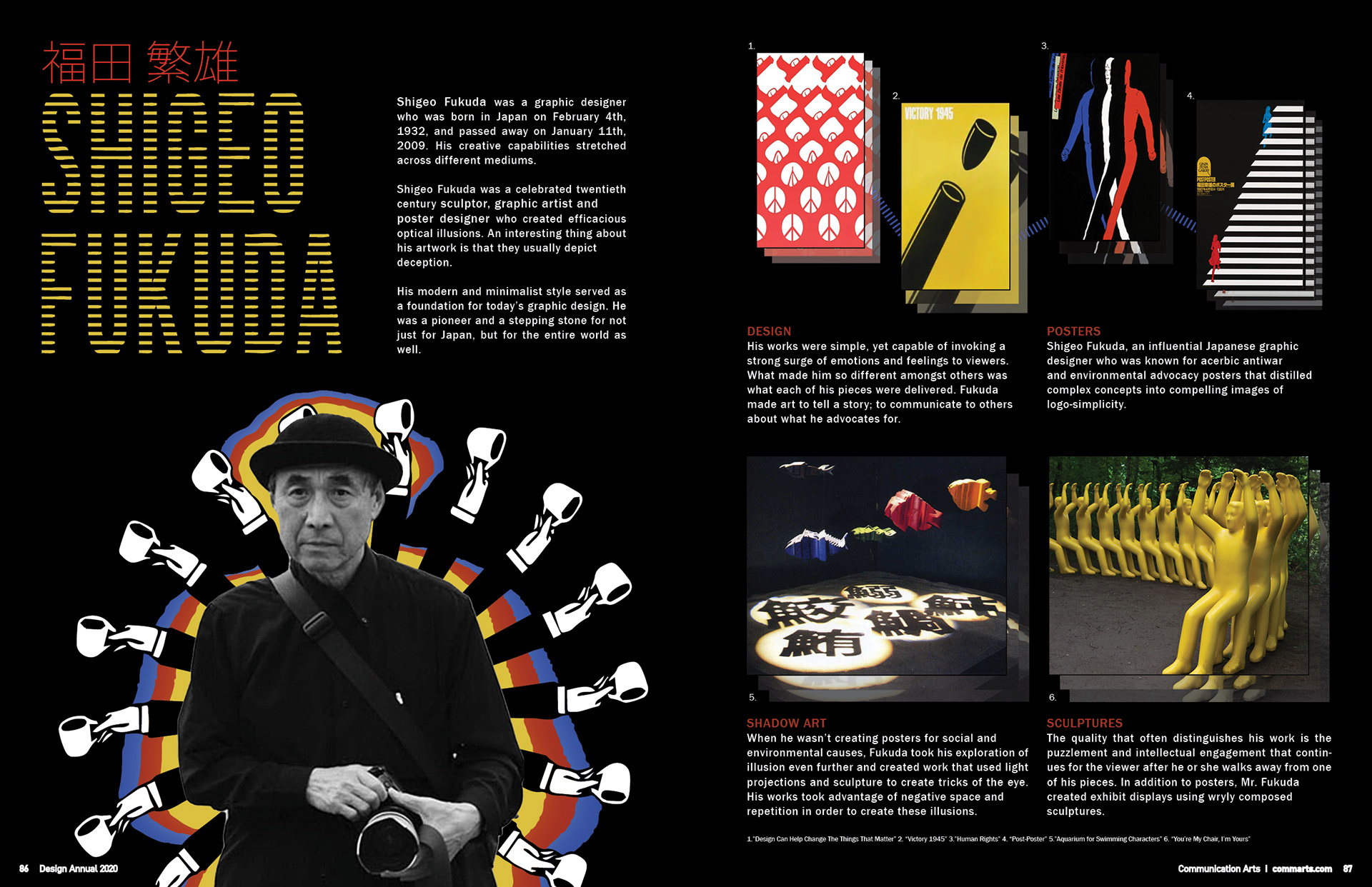
Magazine Spread of Shigeo Fukuda
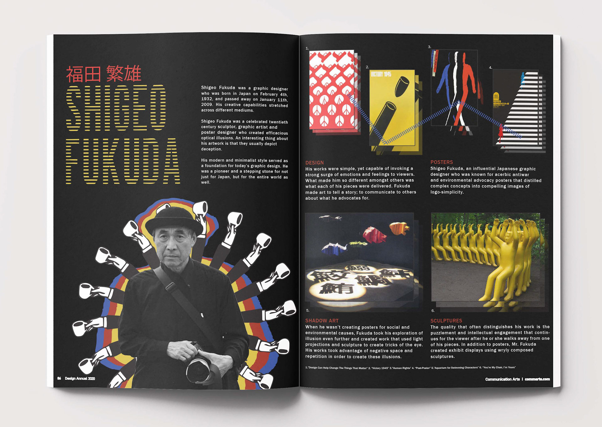
Magazine Spread of Shigeo Fukuda
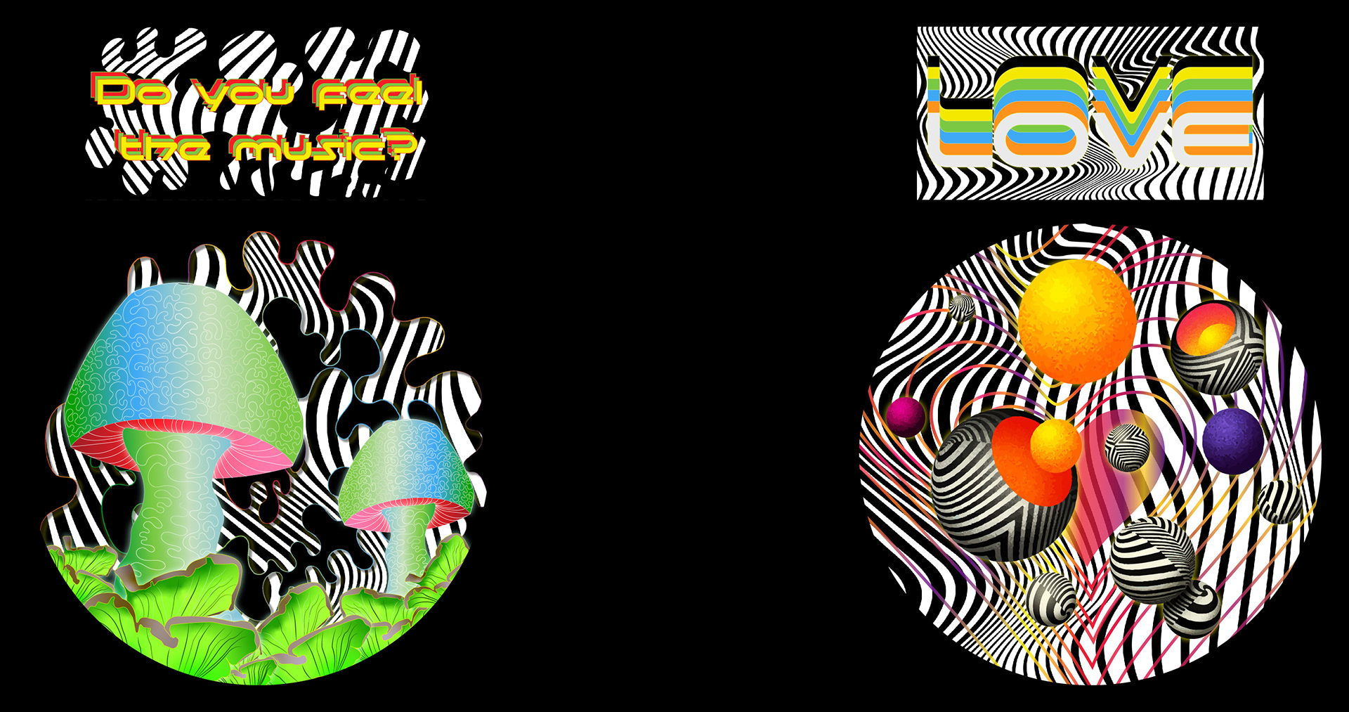
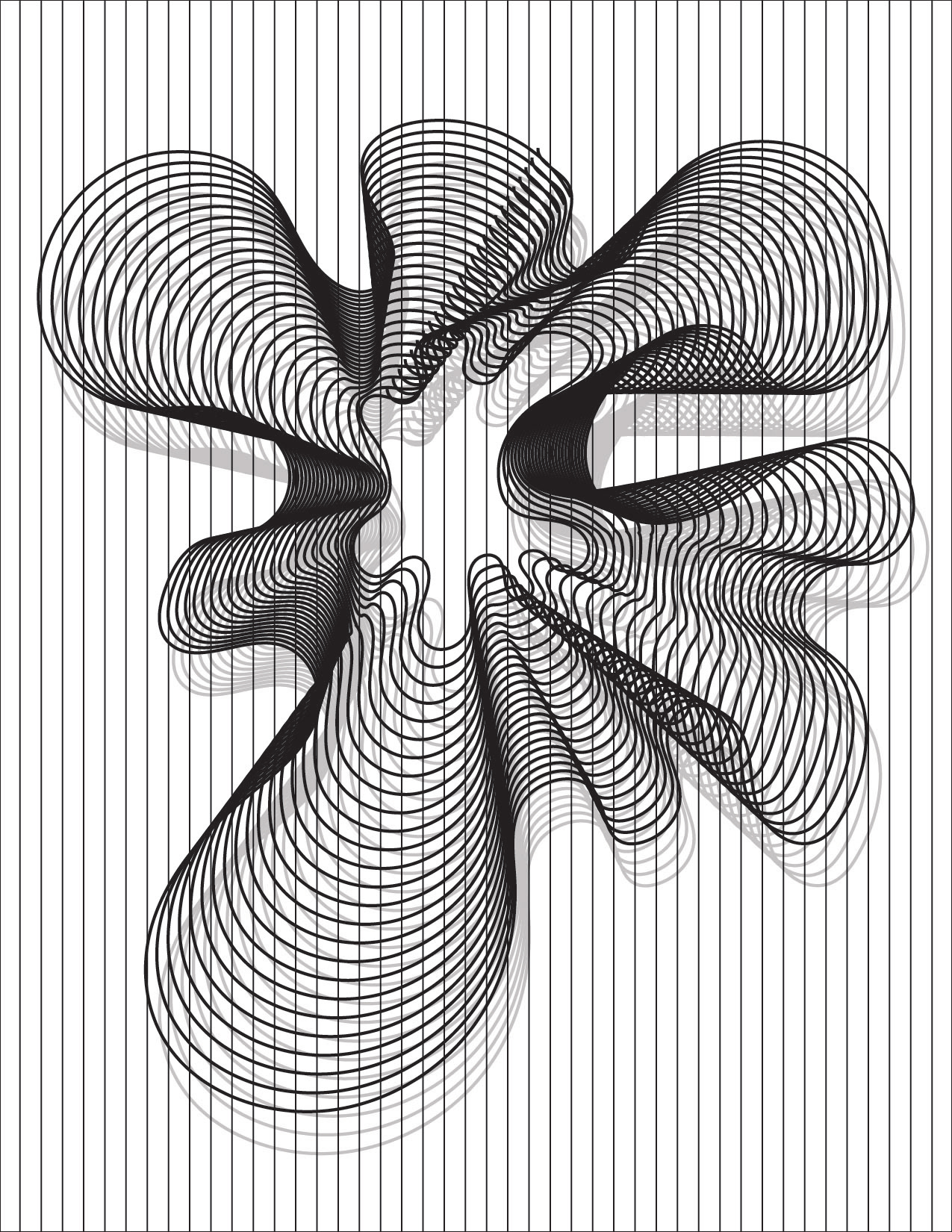
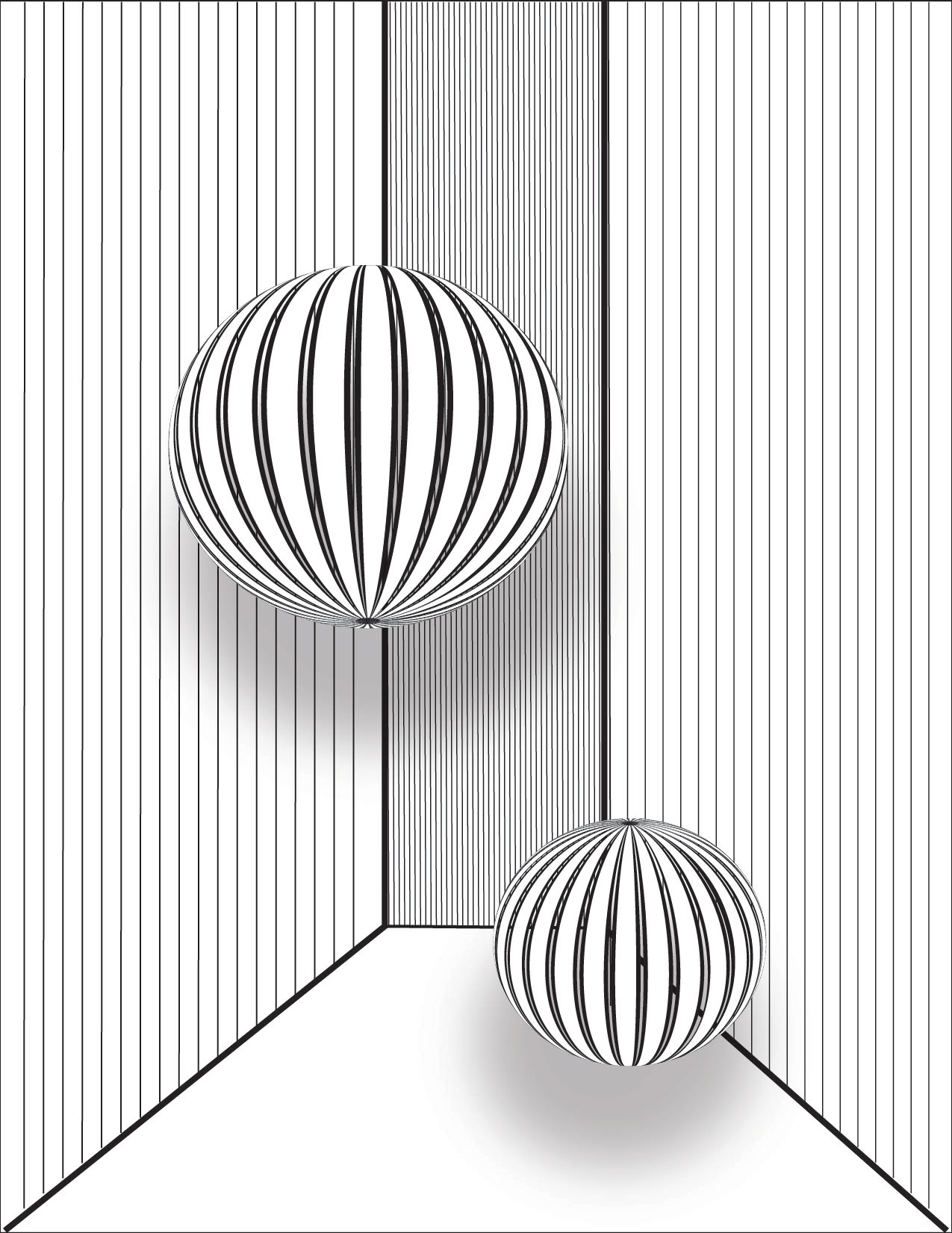
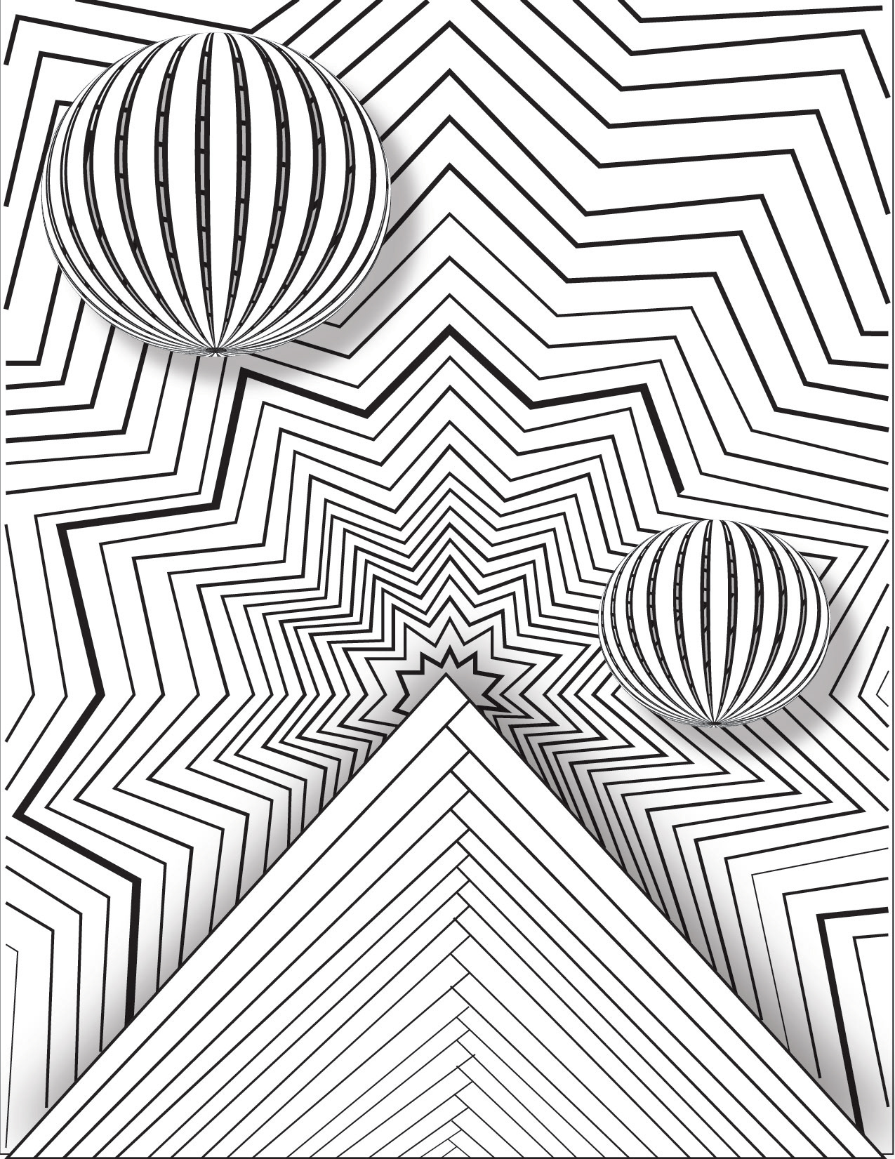
ADOBE: EDC Art CAR CHALLENGE
This project was submitted as part of the Adobe Creativity Tour challenges. The Art Car challenge was to create a design for their art car visuals that included two selected assets provided. I chose to use the typography, illusion patterns, and color assets they provided. I wanted to focus on the illusion aspect, add colors to highlight focus areas, and create dimension.
Clock FACE PROJECT
This project was made using Adobe Illustrator. It intends to depict the phrase "ship has sailed." It was later laser cut into the clock on the right. The goal was to visually represent the chosen phrase and use lines to create movement.
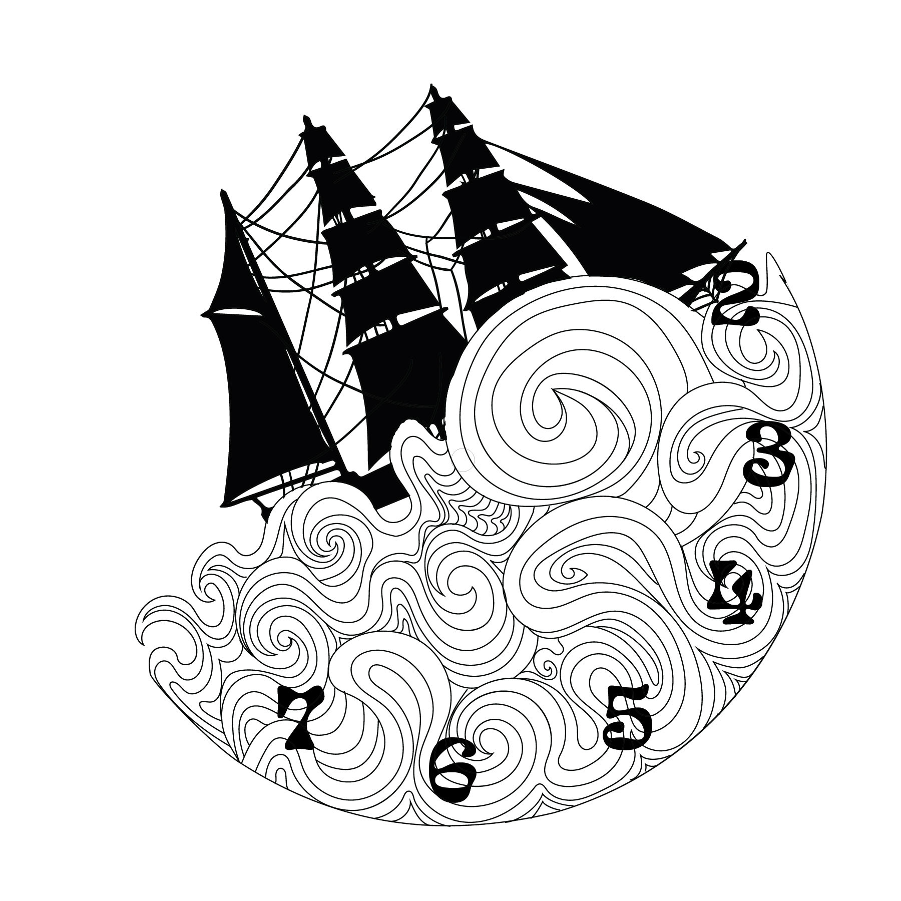
Clock Face Project
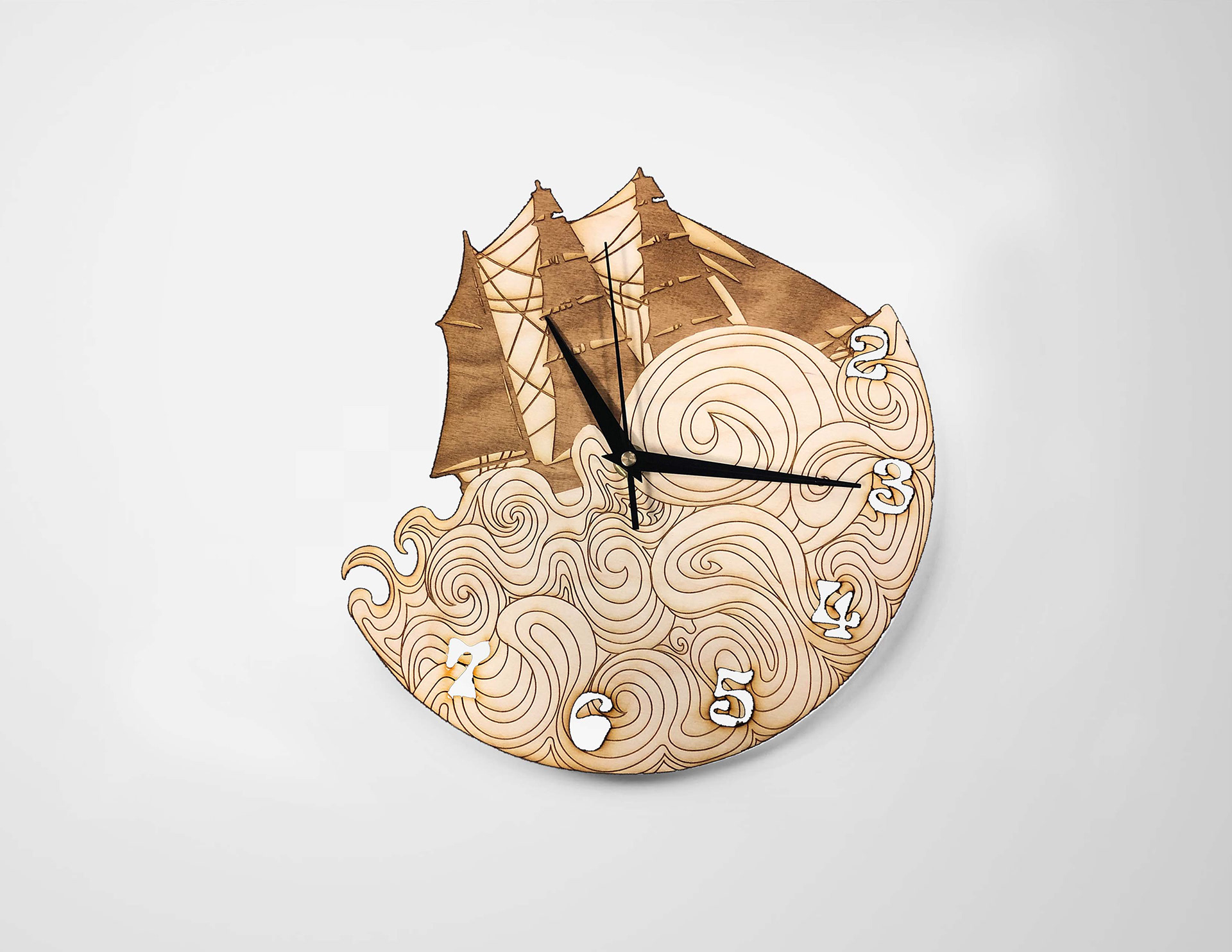
Laser Cut Clock Face
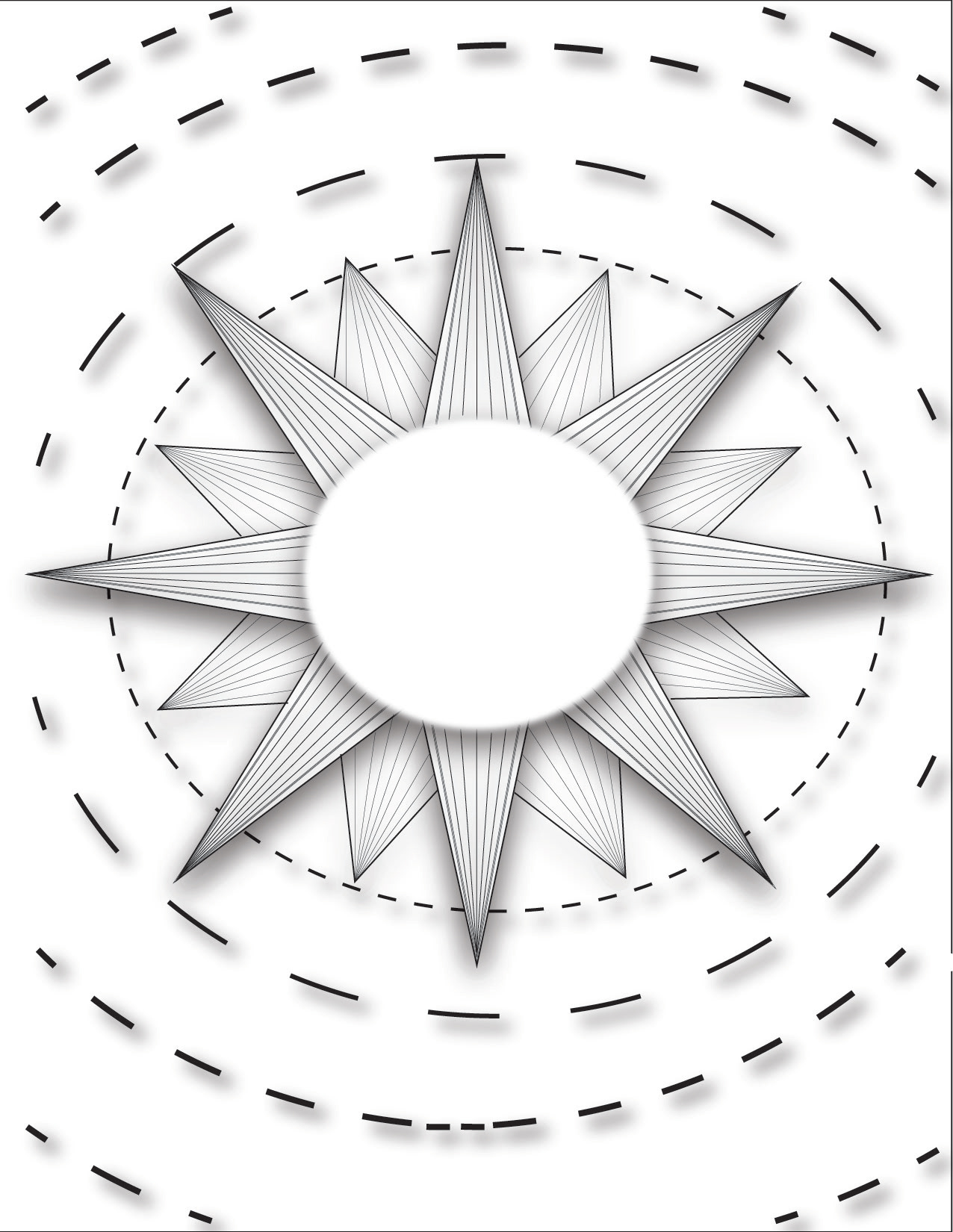
Line Art Project
The series consists of six pieces, which start with Actual Lines, Vertical Lines, and Diagonal Lines at the top. The bottom designs are Implied Lines, Horizontal Lines, and Texture Lines. It was also the first attempt to use Adobe Illustrator.
Actual Lines
Vertical Lines
Diagonal Lines
Implied Lines
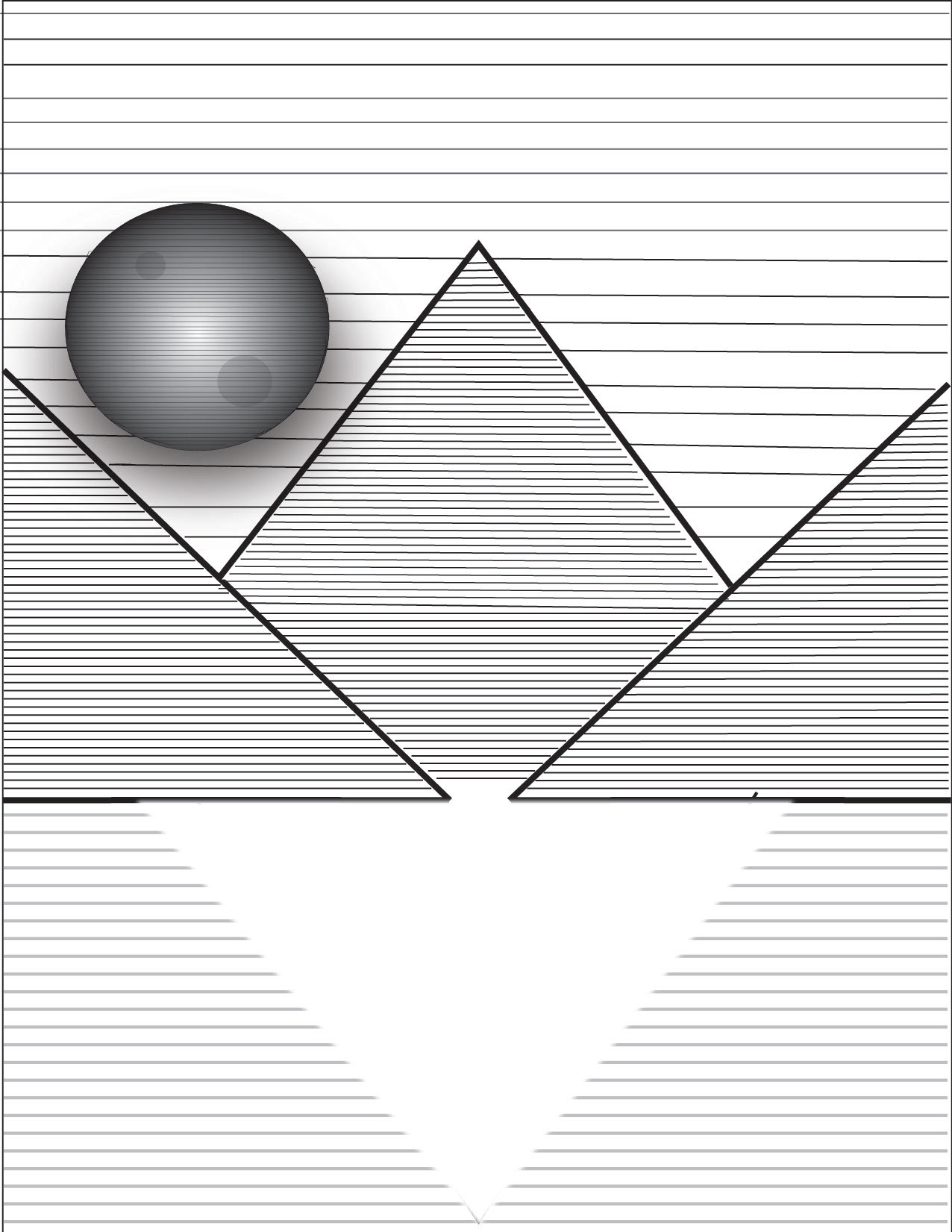
Horizontal Lines
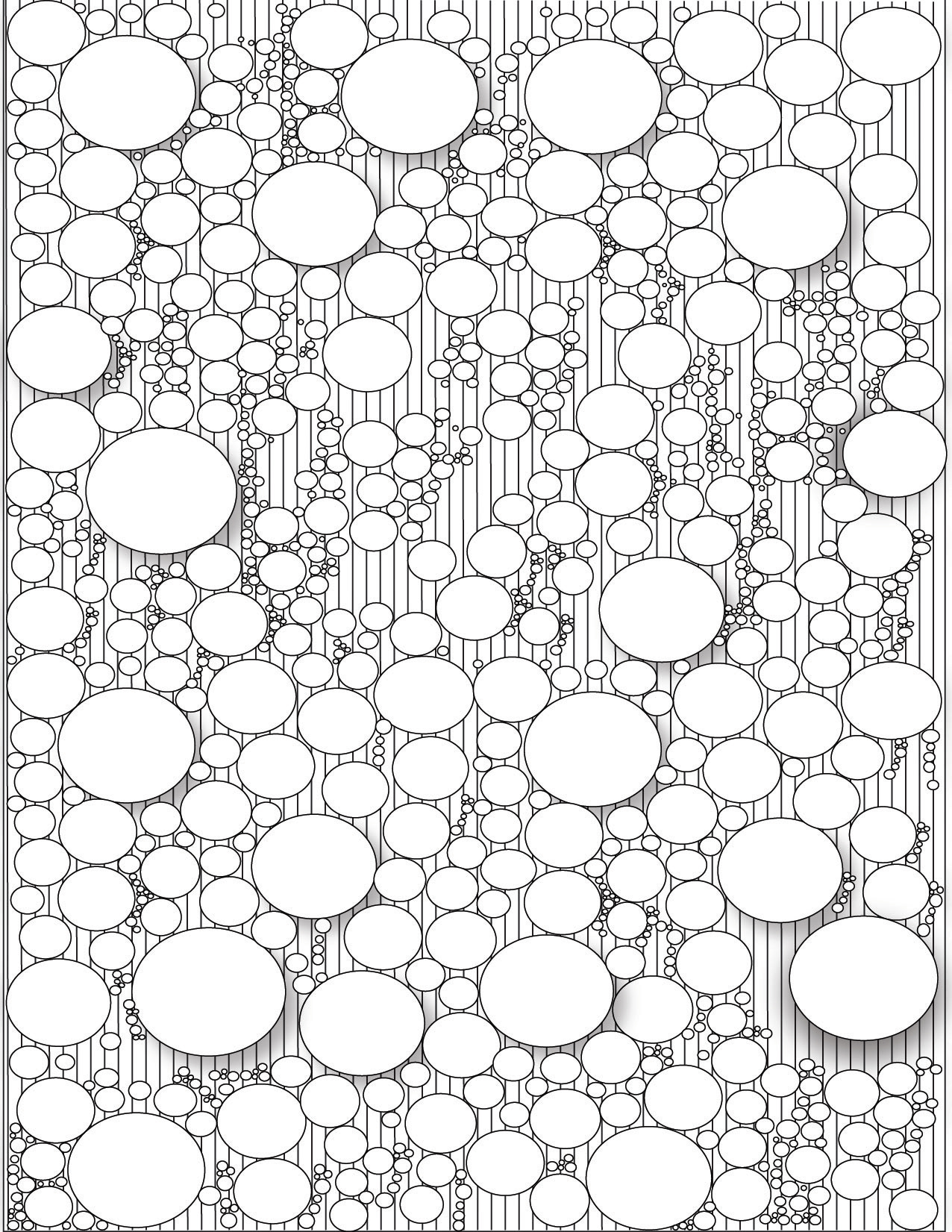
Texture Lines
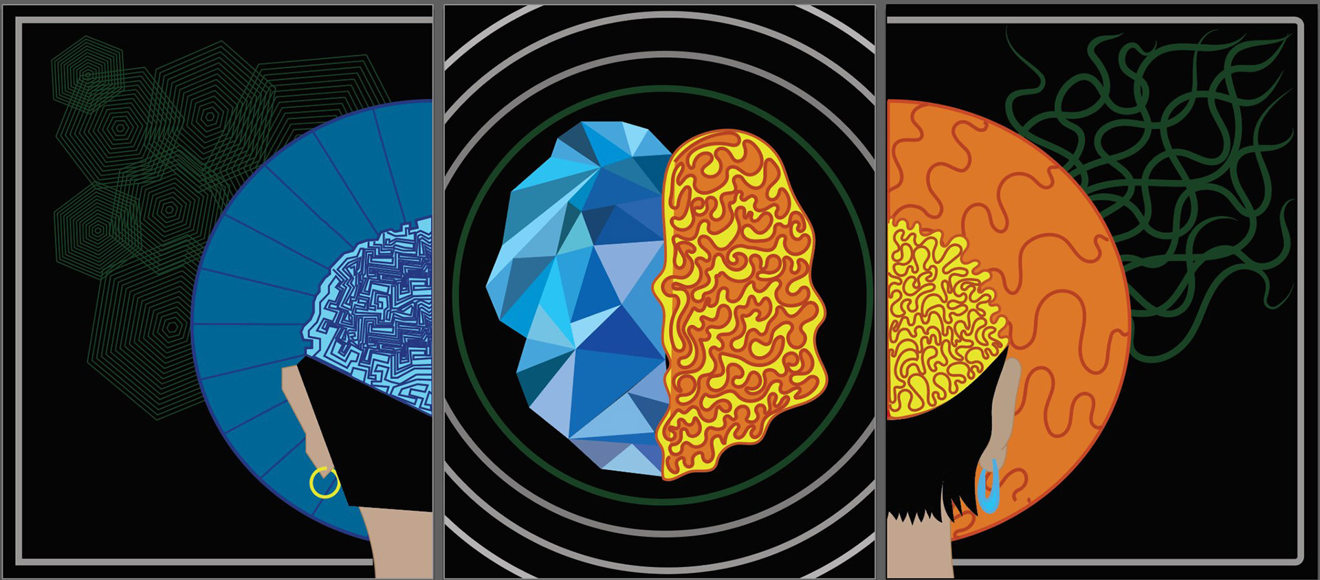
Triptych
This series consists of three pieces. The left and right works started as a diptych and then became a triptych with the third piece. The left work shows the left brain through geometric lines, and the right piece is the right brain and uses organic lines. The middle design represents the unity of both sides. The colors are complementary and also represent cool and warm colors.